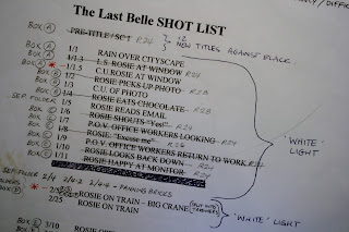
Back this week to the sifting of The Last Belle artwork boxes.
I've just come across some bits and bobs tucked into a folder that remind me just how much fun it can be to work in a non-digital, low-tech kind of way. Part of the brief for The Last Belle was to hand draw everything - even the technical and props stuff - so that the film would have an old-school, retro feel to it, like a 1940s cartoon.
Here's one example of how we applied 'retro thinking' to the film - During the plot of The Last Belle we establish just how much beer Wally is drinking before his date. He's always holding a can, or drinking from a can, or littering the floor with the empties. It didn't even occur to me this might cause production problems further down the line, so I merrily scribbled out storyboard panels like this:
And rough layouts of the inside of his fridge, like this:
Then came the design phase, where we got into the details of exactly how these beer cans should look...
It turns out there are very specific colours that imply 'alcohol', rather than 'soft drink'. I had never been conscious of this, but when we tried various invented colour schemes for the cans they always ended up looking like lemonade, or Coke, or something similar. The solution was to go out and buy every variety of beer can we could find and bring it back to the studio for, er, a study session.
Tough job, but somebody had to do it. All in the name of Art, etc...
And we found that, amazingly enough, there are a certain range of colours that always crop up on alcohol tins. Strange what you learn while working on a film. So we took this information - making sure our can didn't look too similar to any particular real-life brand - and applied it to our design.
My preferred method of finding colours for a specific prop, or character, in The Last Belle was to use marker pens and coloured pencils on paper, and then when I'd got something I was happy with hand it over to a Colour Modeller - in this case the brilliant Sam Spacey - to refine, and find the equivalent range of colours in cel paint, or to mix them specially.
In the meantime, while all this was going on, it suddenly dawned on me and co-layout artist Mark Naisbitt that these cans, and the lettering on them, were very labour-intensive to draw... and we had literally thousands of cans to draw: hundreds in the background layouts and thousands within the animation itself, with all that lettering and design in different sizes and perspectives throughout.
Not something that'd be a problem in the digital realm, but to hand-draw all of these thousands of cans... Nightmare!
Then came a very low-tech brainwave: I flattened out our can design, drew it on a sheet of paper, wrapped it round a real beer can, and simply photographed it from every possible angle. I took endless photos, just like these:
Then we made up several sheets of drawings, tracing from the photos (without rulers, to keep a hand-drawn feel). Mark also distorted some of the can drawings to give us scrunched up cans:
Once we'd got this library of can drawings it was fairly straightforward to photocopy them at various sizes and cut them together to create layout designs. Here's a can layout by Mark:
Here's the same layout drawing photocopied onto cel, hand painted, and shot against the background:
And here's a small section of the fridge interior:
It's all amazingly low-tech, but I found it strangely satisfying for that very reason...
Using this method we churned out the thousands of cans, with all their details, that we needed for the film. And it was fast to do.
Who needs Photoshop when you've got scissors, sticky tape, and a photocopier tucked away in the corner?


.jpg)
.jpg)


