Tuesday, 26 March 2013

Character Design - part two

Unlike the two characters we met last week, Rosie had a somewhat tortuous birth. Possibly the reason for this is that she barely existed in my first drafts of the script: early on I had concentrated on Wally's slapstick attempts to make it to a bar to meet his date, but the date herself was very secondary to the story. She could have been anyone - I was focusing on the journey, rather than the destination. With this in mind, Rosie started out more or less as the female equivalent to Wally: a big-nosed, crude creature, with ping-pong balls for eyes.


Well, they say Like is attracted to Like...


What a delightful couple they might have made...

I even began to do a bit a storyboarding using this prototype Rosie:


But as the story began to develop I became more and more interested in her character, and what she was thinking and feeling as she sat waiting in the bar for her date to turn up. I began to redraft the script and brought in my friend Jim Maguire to help me with the writing process. Slowly, Rosie became less and less similar to Wally, and more and more his complete opposite: whereas Wally is always moving, Rosie is mostly still; Wally is always silent, Rosie is always talking; Wally doesn't think at all, Rosie thinks too much; and so on. The more sophisticated Rosie became, the more I needed a design that would allow me to display her thoughts and feelings, yet still sit within the same world, graphically. This crude design wasn't going to allow me that. So it was back to the drawing board.


I gave her some flesh colour and separated the head from the body a bit and lowered the eyes, but found this drawing horribly simplistic, ugly and unappealing...


Another in a series of endless doodles... I have dozens like this one, all different girls.


Here's a hesitant blue sketch scribbled on the corner of a piece of paper. She's got a large mouth, able to cope with the dialogue, and similar eyes to Wally. She's beginning to feel part of his 'world' graphically, but different enough as a personality. I started to feel I was getting somewhere... but she still wasn't quite right. I was starting to get very frustrated by this point.


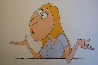
Then, one day: I remember absent-mindedly scribbling this (above) while I was talking to a friend. I wasn't even consciously thinking about Rosie's design, and I was barely even aware my hand was doodling, but when I  noticed the sketch a few hours later I realised that I'd moved her eyeballs right to the top of her head, just like Wally's, and given her the overhanging upper lip that allows her to look permanently worried (which she is for most of the story). I can credit this doodle to my drawing hand, or some deep recess of my unconscious brain, but not to any conscious thought process. Sometimes these things just float into you, like happy dreams in the night. This was the point where I felt we had 'discovered' Rosie. Simple though this sketch is, she felt familiar to me... someone I'd be happy to spend time sketching; a rhythm of lines and curves that were a pleasure to draw.

Sometimes it takes an awful amount of effort to end up with something as simple as this.


From this point on it was a matter of playing with proportions and seeing if this face could express all the emotions I needed it to. By the time Sienna Guillory came in to record Rosie's voice I had this colour sketch to show her - still not quite right, and still a bit frumpy, but something I hoped would help Sienna visualise the character.


Once the recording session was done I used Sienna's performance to help refine Rosie's design. Not in terms of looks (I'm not a fan of trying to caricature an actor's face) but in terms of the rhythm of speech, the melody, the general feel: all this affects how the mouth works, how far it needs to open, how mobile the eyes need to be, and so on.


And it's also during this process you can try out the different costumes or hairstyles that might be required for the story:


Rosie getting ready - hair washed and towel
turban in place.

By the time the animatic drawings were complete, often in colour like the one above, I was one hundred percent comfortable with Rosie, both as a character and as a graphic design. This meant that the animation phase was a total pleasure, free from any stress. I guess this is the animation equivalent to film or theatre rehearsals: building a character, the walk, the clothes, the speech patterns, the internal thoughts, so that the end result in front of an audience appears as 'alive' and fully rounded as possible.


Final production cel of Rosie with her hair tied back.

So, in much the same way Wally struggles to find Rosie for his date, I struggled to find her at all. But find her we did.

I wonder what she's up to right now?

Oh goodness... I feel a possible sequel coming on...


Wednesday, 20 March 2013

Character Design - part one

Of all the phases in developing a film, character design gives me the greatest heebie-jeebies. Not that it isn't a fun process, but creating a character you are happy to live with for the months/years it will take to bring to life, that sits in with the overall look of the film, and that will be able to perform all the things that is required of it (Is the face mobile enough to express emotions clearly? Are the arms long enough to reach for the props? Does the structure of the head work face-on and in profile and in three-quarter view?) can be a daunting task. It's the exact same process as casting a live-action film with real actors: so many directors have been quoted as saying that eighty percent of their work is done already if they get the casting right. (Vivien Leigh was born to play Scarlett O'Hara in 'Gone With the Wind' - no other actress could have touched her interpretation; but Alec Guinness - brilliant, brilliant actor that he was - should never have been talked into slapping on brown make-up and playing the Indian character Godbole in 'A Passage to India'. A horrible distraction in an otherwise amazing movie.)

The look of our central character, Rosie, was a struggle to find (more on this in the next post). But sometimes things can fall into place with incredible ease. Take, for example, the character of The Barman who serves Rosie as she sits in a bar waiting for her date to arrive. This was the first sketch of The Barman I made, and it's not a million miles away from the final design:


There's a reason this first sketch came easily. One of my oldest friends is David Bowers, director of live-action movies such as the recent sequels in the 'Diary of a Wimpy Kid' series. We met up at college, and David became a very good animator and story artist, and in the process managed to sneak caricatures of me into a couple of the productions he had worked on. I was never able to return the compliment until I put The Last Belle into production and decided to model the Barman - very loosely - on David. (I say 'loosely' because caricature is not my strong point, and my often odd-looking drawings are hardly complimentary. But sometimes it's good to start with a real face as a jumping-off point, and then let your pencil take you where it will.)

I'll usually take a drawing like this and begin to sketch out poses and expressions that I know will be required to tell the film's story. In this case I changed the nose and played with the general proportions:


 And the more confident I felt, the more I'd work into full colour (pantone pen on paper) animatic poses, which then became the basis for the key animation drawings:


 Our drunken lout, Wally, was the first character to be designed, and the character from which the whole concept of the film developed. He first appeared in the corner of a sketchbook looking like this:


Knowing that he was drunk throughout the film, I wanted to keep his outline scratchy and irregular, as if it's falling apart. (Ronald Searle's line quaity was a huge influence here.)


Now he's getting a bit fatter, and I've moved the eyeballs right up to the top of his head. These quick ink sketches were made playfully and unselfconsciously, not to try and create 'good' drawings (were it not for this blog these drawings would never have seen the public light of day), but to see how expressions and proportions might affect the face.


So now I've moved the eyes to the top of the head can I get a frown, or a bored look? Quick doodles answer the questions...


Getting looser and faster now...


And as the body gets fatter the head gets smaller (well he's not the smartest of guys)...


And now the dreaded bermuda shirt has appeared. It seemed a funny idea at the time but hand animating it probably added about five years to the production schedule. You live and learn. The eyes are a little bigger and the nose a little smaller, but this has the unfortunate effect of making him 'cuter'. Sort of.


So to counteract this the eyes get even smaller and the nose even bigger. And by this stage I'm comfortable enough to start doing quick storyboard sketches, and feel 'in character'.


We have our man!

So these two guys were fun to develop. But Rosie proved harder to pin down. That collection of frustrated and irritated sketches I will save for the next post...


Monday, 11 March 2013

Circus

Over the past few weeks - as you may have noticed - I've not had much chance to rummage through the Last Belle artwork boxes. This is because I've been up against a rather nasty deadline on a commercial project.

Is it me, or are production schedules getting shorter every job? Having achieved the next-to-impossible on one project you are required to achieve the almost-totally-impossible on the next.

In these situations it's great to have a core group of people around you - a little film family, if you will - on whose talents you can rely, totally. Producers, animators, assistants, compositors; a bunch of disparate characters who consistently help you get out of trouble when you need it most. Not unlike The A-Team (does that make me George Peppard?)

As usual, my big fat head is trying to soak up the limelight.
Let's remove it...

That's better! My clean-up crew on the latest job, ready to deliver the impossible:
(left to right) Aude Carpentier, Justine Waldie, Katerina Kremasioti,
Angeline de Silva and Alan Henry.


As we jump from job to job I am reminded of a circus rolling in to town: a little band of artists and technicians coming together to put on a show, before dismantling and disbanding, vanishing over the horizon in search of the next gig.

Who knows what, where or when the next gig will be, but in the meantime - job delivered - I'll be diving back into those Last Belle artwork boxes shortly.

More to come...

Sunday, 3 March 2013

Nomination!

A very belated Thank You to Big Screen Animation for nominating The Last Belle as one of the best shorts of 2012, in the illustrious company of this year's Oscar winner Paperman.


We're feeling very honoured indeed to have been on your list. Thanks guys!